
Portfolio Services About Blog FAQ Contact Book a Free Consult
The Work

Web Design Portfolio

Website redesigns for London, Ontario businesses, built to be found on Google, plus the branding and photography that went into them.

Lumen House

Squarespace to WordPress Rebuild

Client Work · Richmond Street, London ON · lumenhouseldn.com

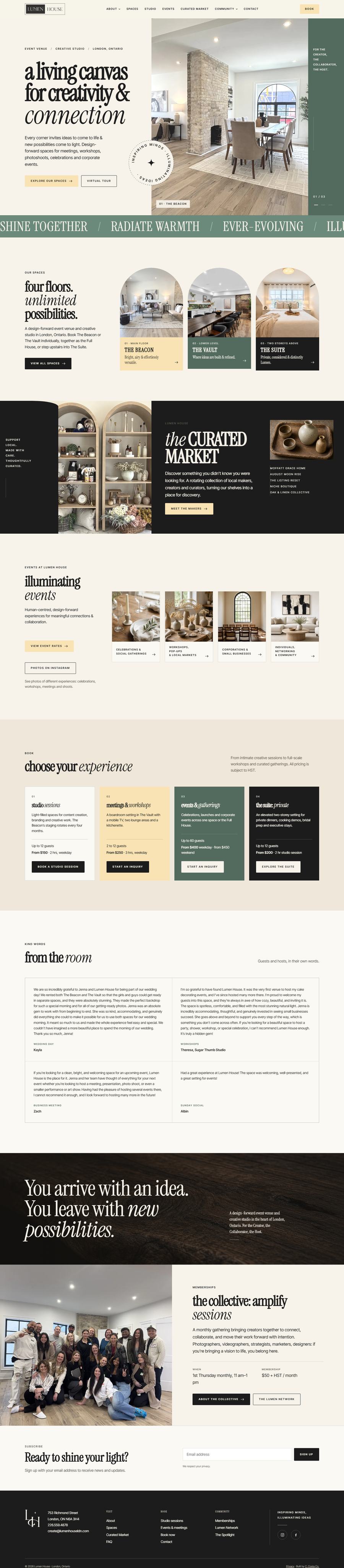
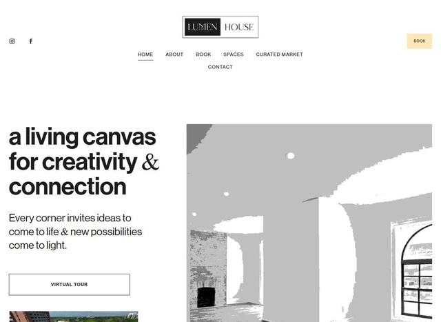
Lumen House is a four-floor event venue and creative studio on Richmond Street, but the Squarespace site opened on a posterized graphic a first-time visitor couldn't read as a room, and kept every price three clicks deep. I rebuilt it as a custom WordPress theme: twelve pages designed around the real Beacon, Vault and Suite, with starting prices on the homepage and the venue finally described in a language Google can read.

After

From a posterized hero to a photography-led venue

  • Designed around real photography of all three spaces
  • Starting prices and capacity on the homepage
  • A custom WordPress theme, owned rather than rented
The new Lumen House homepage: a custom design built around photography of The Beacon, The Vault and The Suite
Explore full-size ↗
The old Lumen House website: a Squarespace template opening on a posterized graphic of The Beacon View full-size
Before

The entire old site, small enough for the corner: a Squarespace template, a hero you can't read as a room, and not one price until the third click. Behind it, the new site speaks for itself.

Photos Described for Google
0 → 0
Starting Prices on the Homepage
0 → 0
Schema Types Google Can Read
1 → 0
Custom Theme, No Squarespace Template
0%

More than a new look

The design is the part you can see. The bigger upgrade is everything underneath: the site was rebuilt so Google understands that Lumen House is a venue, where it is, what it costs, and which room you are booking.

Site Structure

Twelve real pages, not eighteen URLs

The old sitemap listed eighteen addresses, but only twelve were real. The rest were Squarespace template leftovers, still live and visible to Google: a journal of soap-making and hand-sanitizer posts, a stockists page, and a duplicate homepage. Every piece of genuine content was kept and rehomed, the leftovers were retired behind 301 redirects, and The Spotlight moved into Spaces where it belongs, beside the room it is about.

Headlines & Titles

Written the way people actually search

Nobody types "a living canvas for creativity and connection" into Google. They search for an event venue, a meeting room, a photo studio in London. Every page now carries a hand-written title and description tuned to its own search phrase, from event venue rental and meeting space rates to studio sessions and photo studio rental, while the brand's own voice keeps the headline above it.

Structured Data

A venue Google can actually read

The old site emitted one generic block of Squarespace markup with an empty description, so Google was never told this was a venue, where it stood, or what it cost. The new site carries EventVenue and LocalBusiness markup with the address, phone, email, founder, capacity, amenities and all three spaces, plus FAQ markup, Service and Offer pricing on Studio, Events and The Collective, and breadcrumbs on every page.

Booking

A price before anyone bounces

Rates and booking links existed, but they were scattered across Book, Studio and Events, so a visitor had to go hunting. The homepage now ends on a choose-your-experience row: studio sessions, meetings and workshops, events and gatherings, and The Suite, each with a starting price, a guest capacity and a button that lands on the right Acuity calendar. All four calendars carried over untouched.

Photography

The room, not an abstraction of it

For a venue, the photos are the product. The old homepage led with a posterized, high-contrast graphic of The Beacon that a first-time visitor could not read as a room at all. The new homepage opens on a rotating hero of the real Beacon, Vault and Suite, and the three spaces, the Curated Market shelves, the makers and the Collective are all shown in Lumen House's own photography.

Access & Speed

Everything crawlers and visitors expect

The twelve old pages carried 174 images with empty alt text, invisible to Google and to anyone using a screen reader. Every photo is now described. Alongside it: a skip link, labelled navigation, keyboard-friendly menus, native FAQ accordions, one main heading per page, a contrast-checked palette, reduced-motion support, and optimized WebP images that lazy-load below the fold.

What the new site is built to answer when someone in London searches…
Search on Google Old site had New site has
"event venue London Ontario" A generic markup block with an empty description EventVenue and LocalBusiness markup, plus a matching title
"event space rental prices London Ontario" Rates split across Book, Studio and Events Starting prices on the homepage and a dedicated Events rate page
"photo studio rental London Ontario" A Studio Sessions page with no price in the title A Studio page with a rate card for each of the three spaces
"meeting room rental London Ontario" Nothing in a headline or a title The Vault meeting rates, with capacity and Offer markup
"local makers London Ontario" A leftover Stockists page from the template A Curated Market page with five makers, bios and shop links
"my soap making process" A live template blog post, diluting the whole domain Retired, with a 301 redirect so nothing breaks

Need this for your website?

This is how I build, whether you're starting fresh or your current site isn't pulling its weight.

  • SEO-first structure: a dedicated, keyword-targeted page for every space and service you rent, so each one can rank in local search.
  • Local search built in: structured data that names what you are and what you charge, consistent business details, and titles written the way your customers actually search.
  • A site that looks like you: designed around your real brand, photos and rooms. Never a template.
  • Owned, not rented: a custom theme on your own domain, with a migration plan and 301 redirects so no search traffic is lost on the way.

Scroll inside the panel to explore the full case study.

Buragina's Men's Fashions

London Website Redesign

Client Work · Oxford Street East, London ON

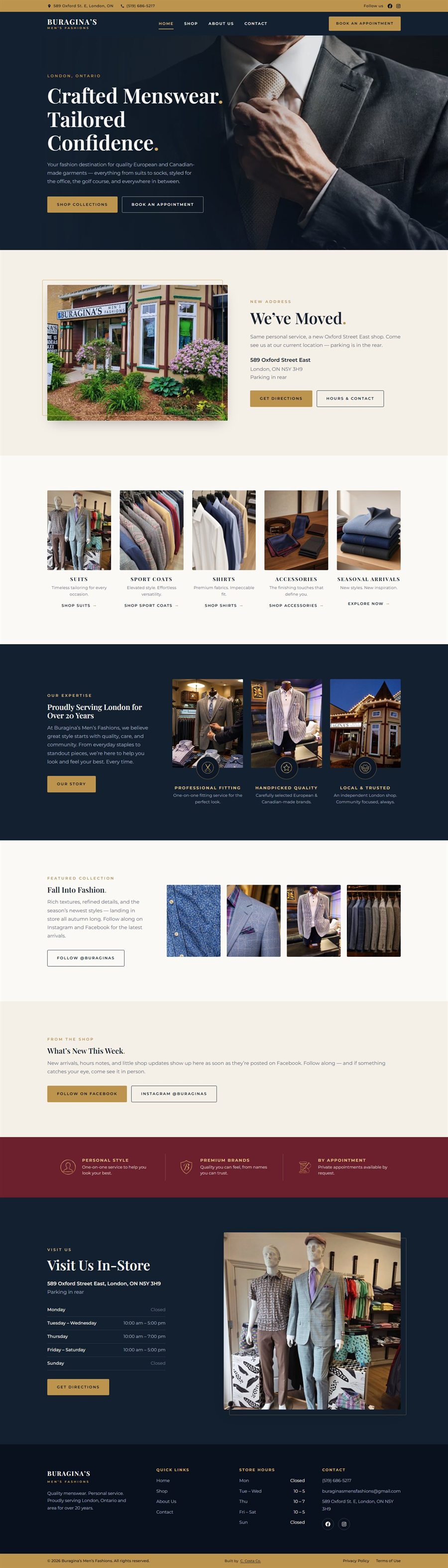
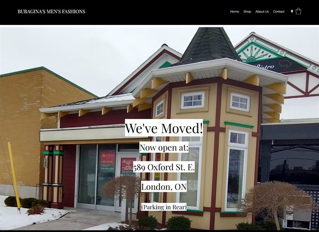
Buragina's has been London's menswear destination for over 20 years, but the website was a black Wix template: a We've Moved overlay, an about paragraph, and a contact form, with long stretches of empty black. I rebuilt it from scratch around in-store photography: five collections, hours, and appointments, so the site finally looks like the room a client walks into and is built to be found on Google.

After

From a Wix template to a photography-led destination

  • Designed around in-store photography of the shop
  • Five collections, from suits to seasonal arrivals
  • The new Oxford Street East address on every page
The new Buragina's Men's Fashions homepage: a custom design built around in-store photography
Explore full-size ↗
The old Buragina's website: a Wix template with a We've Moved overlay on the homepage View full-size
Before

The entire old site, small enough for the corner: a Wix template, a We've Moved overlay, and a contact form. Behind it, the new site speaks for itself.

In-Store Photographs
0 → 0
Collections Named for Search
0 → 0
Brands Named on the Site
0 → 0
Custom-Coded, No Wix Template
0%

More than a new look

The design is the part you can see. The bigger upgrade is everything underneath: the site was rebuilt so Google understands who Buragina's is, where they are now, and what a man in London actually walks in to buy.

Search Structure

Collections a search can land on

Google ranks pages, not websites. The old Wix shop was a blank promise in the nav, so someone looking for a suit, a sport coat, or a dress shirt had nowhere to land. The new shop page names five collections in full, from suits and sport coats to shirts, accessories, and seasonal arrivals, each with the brands Buragina's actually carries.

Headlines & Titles

Written the way people actually search

The old homepage led with a We've Moved overlay and never put London in a headline. The new homepage pairs the brand's voice with "London, Ontario" in the kicker, and the browser title names menswear in London on the first line. Shop, About, and Contact each carry their own hand-written title, so every page can rank for its own search.

The Move

One consistent identity for the new shop

Local ranking lives and dies on consistency: the name, address and phone matching everywhere Google looks. The old site announced the move as text boxes on a single photo. The new site gives Oxford Street East a section of its own: the storefront, parking in the rear, directions, and the address on every page so a first-time visitor and Google are looking at the same door.

Photography

Designed around the shop you walk into

The old template had a storefront snapshot and a cropped suit photo, then a lot of black. The new site is built around photography taken inside Buragina's: mannequins, sport-coat rails, the fitting lounge, the Oxford Street shopfront at dusk. The site finally looks like the independent London shop it represents, not a generic fashion brochure.

Technical Foundations

Everything crawlers expect, in place

The unglamorous checklist that decides whether Google indexes a site cleanly: a sitemap, a robots file, a canonical tag on every page, skip links, and branded preview cards so shared links look right on social media. Hours and the current address sit in the footer of every page, not only on Contact.

Visit & Appointments

Built to bring someone through the door

This is an in-store business, not an online shop. The new site makes that honest: collection pages send you to Oxford Street East, private appointments sit one click from the header, and a live Facebook feed of this week's arrivals sits on the homepage so the site never looks stale between seasons.

What the new site is built to answer when someone in London searches…
Search on Google Old site had New site has
"menswear London Ontario" A sentence inside About The homepage title and kicker
"mens suits London Ontario" Nothing, on a blank Shop page A Suits collection with brand names
"sport coats London Ontario" Nothing A Sport Coats collection of its own
"Buragina's Oxford Street East" A We've Moved overlay on the homepage A dedicated section, plus the address on every page
"Jack Victor London Ontario" No brands named anywhere Thirty brands listed on Shop
"mens clothing store hours London" Nothing listed Hours on the homepage, Contact, and footer

Need this for your website?

This is how I build, whether you're starting fresh or your current site isn't pulling its weight.

  • SEO-first structure: a dedicated, keyword-targeted page for every collection you offer, so each one can rank in local search.
  • Local search built in: the current address on every page, titles written the way your customers actually search, and a sitemap crawlers can follow.
  • A site that looks like you: designed around your real brand, photos and space. Never a template.
  • Fast and future-proof: custom-coded pages that load cleanly, work beautifully on phones, and aren't locked into Wix or any other builder.

Scroll inside the panel to explore the full case study.

Carpe Diem Massage Therapy

SEO-First Rebuild

Client Work · Covent Garden Market, London ON

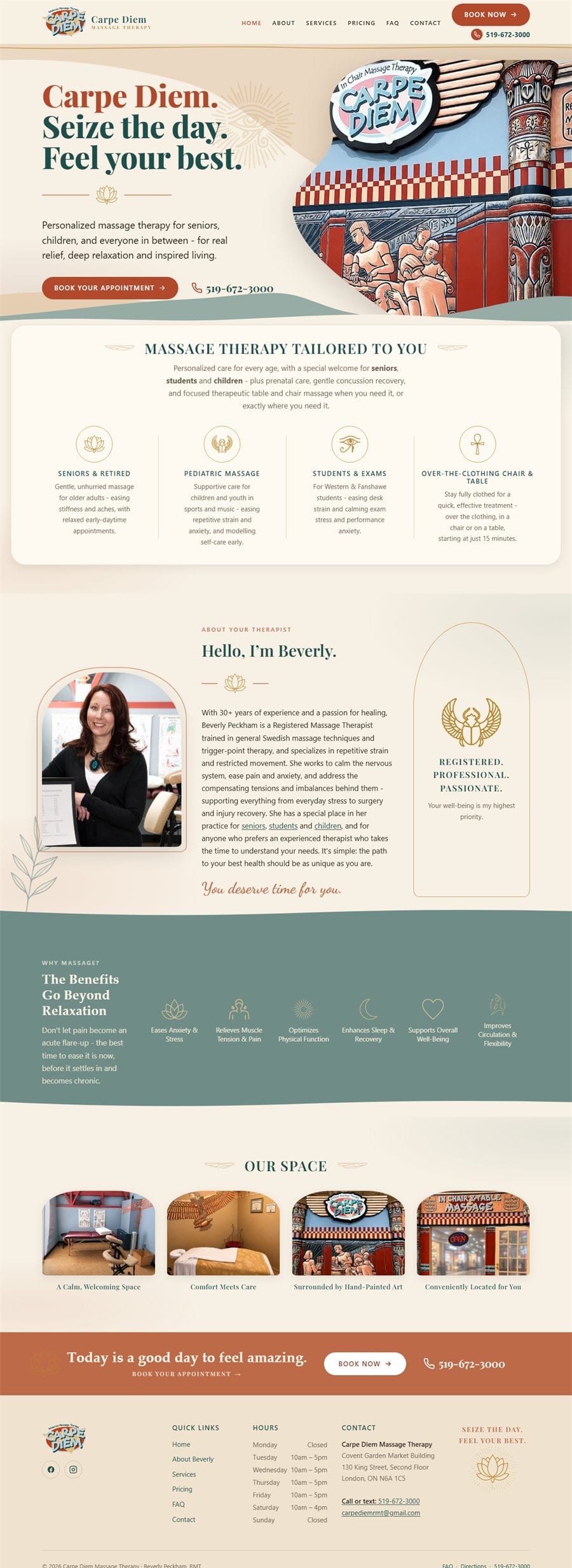
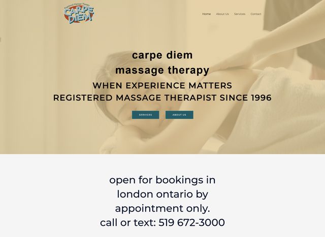
Beverly's massage practice has been a fixture of London's Covent Garden Market since 1996, but her four-page template website, with its stock photos and broken images, didn't show it. I rebuilt it from scratch: 17 hand-coded, SEO-first pages designed around the clinic's hand-painted murals, so the site finally looks like her practice and is built to be found on Google.

After

From a four-page template to a seventeen-page destination

  • Designed around the clinic's hand-painted murals
  • Eleven treatments, each with a page of its own
  • Local SEO and structured data on every page
The new Carpe Diem Massage Therapy homepage: a custom design built around the clinic's hand-painted murals
Explore full-size ↗
The old Carpe Diem website: a generic template with stock photos View full-size
Before

The entire old site, small enough for the corner: four template pages, broken stock photos, and not one mention of London in a headline. Behind it, the new site speaks for itself.

Site Pages
4 → 0
Pages That Can Rank on Google
1 → 0
Google-Ready FAQ Answers
4 → 0
Hand-Coded, No Builder Bloat
0%

More than a new look

The design is the part you can see. The bigger upgrade is everything underneath: the site was rebuilt from the ground up so Google understands exactly who Beverly is, where she practices, and what she treats.

Search Structure

One page for every service

Google ranks pages, not websites. The old site squeezed every treatment onto one crowded Services page, so it competed for every search at once and won none of them. The new site gives each of the eleven treatments its own keyword-targeted page with its own clean address, from deep tissue and chair massage to pregnancy massage and concussion recovery.

Headlines & Titles

Written the way people actually search

The old homepage headline never mentioned London or Ontario, the words every local client types. The new homepage pairs the brand's voice with "Registered Massage Therapy in Downtown London, Ontario" in the same headline, and all seventeen pages carry a unique hand-written browser title and description tuned to their own search phrase.

Structured Data

A business card in Google's own language

Every page now embeds structured data: the machine-readable facts search engines use for the map pack and rich results. Business details, geo-coordinates and opening hours on all seventeen pages, service markup on every treatment page, and FAQ markup that makes fourteen answers eligible to appear directly in Google's results.

Local SEO

One consistent identity for the map pack

Local ranking lives and dies on consistency: the business name, address and phone number matching everywhere Google looks. Those details are now identical to the character on every page, on the contact page, and inside the structured data, ready to align perfectly with a Google Business Profile.

Technical Foundations

Everything crawlers expect, in place

The unglamorous checklist that decides whether Google indexes a site cleanly: a sitemap, a robots file, a canonical tag on every page, exactly one main heading per page in logical order, clean portable page addresses, and branded preview cards so shared links look right on social media.

Speed & Access

Fast for visitors, easy for everyone

Hand-coded pages with no page-builder bloat. Images lazy-load with their dimensions declared, so nothing jumps around while the page loads. Skip links, visible focus states, descriptive alt text and reduced-motion support make the site comfortable for every visitor, and Google measures exactly these things.

What the new site is built to answer when someone in London searches…
Search on Google Old site had New site has
"deep tissue massage London Ontario" A phrase buried in a paragraph Its own dedicated page
"pregnancy massage London Ontario" Two words inside a list Its own dedicated page
"massage for seniors London Ontario" Nothing, on a four-page site Its own dedicated page
"cupping therapy London Ontario" Nothing Its own dedicated page
"massage therapy prices London Ontario" Rates tucked inside Services A dedicated Pricing page
"is massage covered by insurance" 4 collapsed FAQ entries An FAQ page with 14 answers, marked up for Google

Need this for your website?

This is how I build, whether you're starting fresh or your current site isn't pulling its weight.

  • SEO-first structure: a dedicated, keyword-targeted page for every service you offer, so each one can rank in local search.
  • Local search built in: structured data, consistent business details, and titles written the way your customers actually search.
  • A site that looks like you: designed around your real brand, photos and space. Never a template.
  • Fast and future-proof: hand-coded pages that load instantly, work beautifully on phones, and aren't locked into any builder.

Scroll inside the panel to explore the full case study.

The Design Shelf

Design in Motion

Straight from the studio: website designs for the clinics, salons, trades and local favourites of Southwestern Ontario, every one designed from scratch, and every one built to move. Spot your industry on the shelf? Picture your name on the screen.

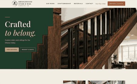
Website design for a custom stair and railing workshop, on a laptop
Custom Stairs & Railings
Animal Hospital
Fencing Company
Plumbing Company
Pet Resort & Spa
Physiotherapy & Hydrotherapy
Law Firm
Hair Studio
Family Dentistry
Dance Studio
Salon & Spa
Optical Boutique
Dental Clinic
Orthotics Clinic
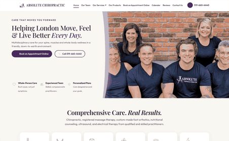
Website design for a chiropractic clinic, on a laptop
Chiropractic Clinic
Your Turn
Want to see your own business on a screen like these? I’ll design a free, no-obligation demo of your homepage before you commit to anything. No deposit, no contract, no pressure. Request your free demo.
Selected Work

Other Projects

Websites, ordering portals, brand identities and communications strategy built for organizations across Ontario. Click any project to read the full story.

The Gallery

Photography & Branding

Brand photography
Brand identity
Brand photography
Brand photography
Brand identity
Brand photography
Brand identity
Brand photography
Brand identity
Brand photography
Brand photography
Brand photography
Brand identity
Brand photography
Brand photography
Brand identity
Brand photography
Brand photography
Brand photography
Brand identity
Start Your Project

Like what you see?

Let's build a website just as thoughtful for your business.

Start a Project